
Digipak
In this section, I will breakdown of how I created my digipak and my reasonings for why I did what I did.
Synergy
By including synergistic elements in my products, I brought them closer to one another and ultimately made a more complete creation. Keeping the same theme throughout is very important to achieve synergy. Nature, trees, plants etc… Are very prevalent on my ancillaries, and all of the colours revolve around these things. On my ancillaries, I carefully chose the photos I used so that they would have a similar colour palette to each other and the video. This was important so that if they were placed next to each other, they wouldn’t look like opposites, instead they would work together.
I also chose the photos so that they would show the park bench. It is the key element of the music video, and it being seen on all three products creates an easy and quick link between them.
In the music video, I used the same “Let it Go” font with the autumn leaf texture as my magazine advert. It is supposed to be the first thing you see, so you instantly know that they are about the same thing. Although this wasn’t on my digipak, the “James Bay” text at the top of the advert, and title of the digipak are the same. I did this to achieve the same effect. By doing this, I aimed to make it easy to link my products together.
Breakdown
Here's my initial planning and template:
My Template

Finished Digipak

(Top half flipped)

Breakdown:
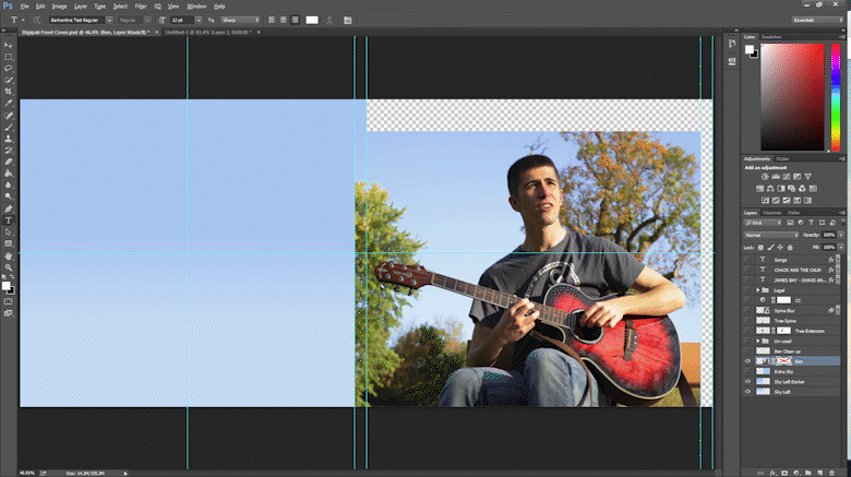
Front and Back Cover


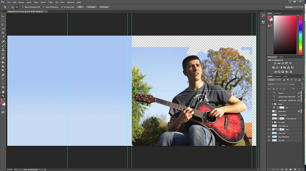

1: The original image is on the right, with the sky re-created using a simple gradient
2: I trimmed the tree, so that it doesn't end suddenly, so I could extend the sky over Ben's head
3: I extended the sky and altered Ben's face slightly


4: The tree in the middle was extened to the left (back) page, so when the digipak is open, the picture flows onto the next page.
5: I blurred the middle so the text that goes there would stand out more easily.


6: All of the text was added, using the same font as my advert to show synergy
7: I added shadows to the text to make it stand out against the bright background
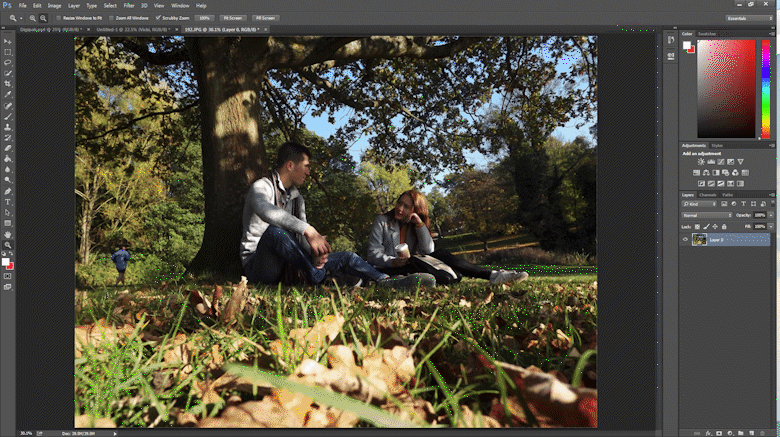
Inside Left and Fold Out


1: The image I started with
2: Which I then made the right dimensions and added the white bar in the middle where the digipak would fold


3: I removed Vicki's shoulder from Ben's pannel for better alignment
4: I moved Vicki over so her and Ben weren't sitting so close together
5: I moved Ben's foot down slightly so that they would lign up better when the digipak was folded correctly


6: I cleaned up where Ben's foot was to make the tree behind them go where it was
7: Final colour correction

8: I placed the images in my digipak template
CD section and Right Hand Side

Both of these images were cropped and colour corrected to fit in with the rest of the images, then put in my digipak template.
